A fictional launch for a room-sized listening machine, staged as an invitation instead of a pitch deck.
Midnight signal / Los Angeles / one room, one dial, no stage.
The room is the instrument.
Null Signal turns architecture into an audio surface. Walls hum, floors bloom, and the listener becomes part of the circuit.
Scroll for the world, then ask for an invite.
What makes this the cool version
A landing page can feel like opening credits.
The strongest concept pages do not start with benefit bullets. They start with a world. For this hypothetical, the product is a private listening chamber that treats sound as architecture. That gives the design permission to be cinematic, tactile, and a little secretive.
The hero stays declarative and spare. The scroll reveals local editorial stills, one physical object, and just enough explanation to make the invitation believable. Three.js handles the impossible object in the background so the page earns its atmosphere instead of faking it with gradients.
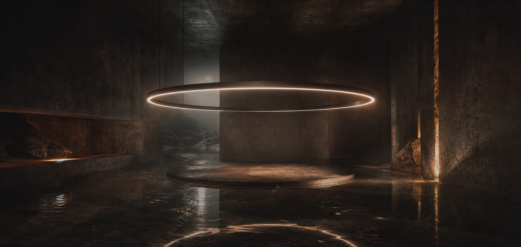
Room zero
Architecture first, hardware second.
Null Signal is imagined as an object you enter, not a device you stare at. The page borrows that same idea. The copy stays low. The surfaces stay dark. The accent only appears when it has a job to do.
That restraint is what keeps the experience from drifting into AI slop. The design is world-building, but every choice still serves one action: make the visitor want an invitation.
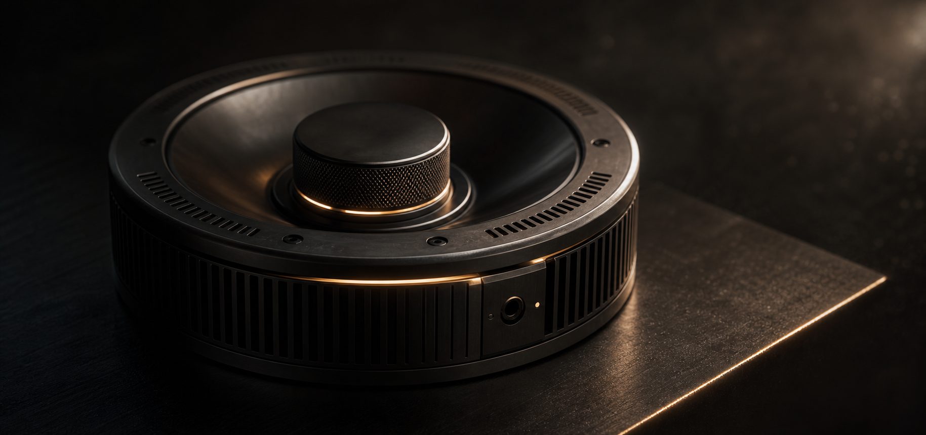
Give the page one object worth believing in.
Great concept pages usually hinge on one thing that feels physically real. Here it is the control unit: machined, heavy, mostly silent. It grounds the speculative story and keeps the page from becoming pure atmosphere.
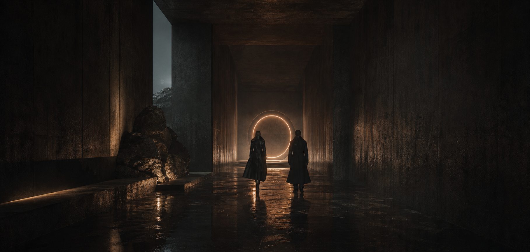
Keep the visitors inside the fiction.
Instead of repeating features, the mid-page rhythm shows arrival, object, and room. That is enough to make the brand feel inhabited. The imagination fills the rest in for free.
Invitation request
Ask for the midnight transmission.
If this were a real launch, the page would end with one clean conversion moment. No wall of buttons, no fake urgency, no invented proof. Just an email field and a clear reason to enter it.